WA Cares Fund
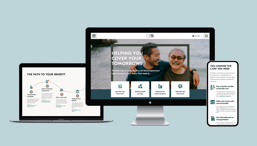
7 out of 10 of us will need long term care at some point in our lives. With WA Cares, Washington is the first state in the nation to offer public long term care insurance, creating affordable access to this care regardless of your economic status. Washingtonians contribute a small percentage of their income into a shared fund, earning them access to the benefit when they need long term care.
My small team at The Holding Co. designed every user facing touch point of this public benefit: the public site, the benefit application, the logged-in portal, the IVR phone tree, and more.
Ready for scale from day one
Unlike typical startup behavior where you ship and iterate through a beta program and beyond, WA Cares had to work for the whole state from the get go. There are so many departments and teams inside the Department of Social and Health Services (DSHS) that support this work behind the scenes.
To understand the breadth of that diversity, we conducted well over 100 interviews with Washingtonians, government staff, and other stakeholders.
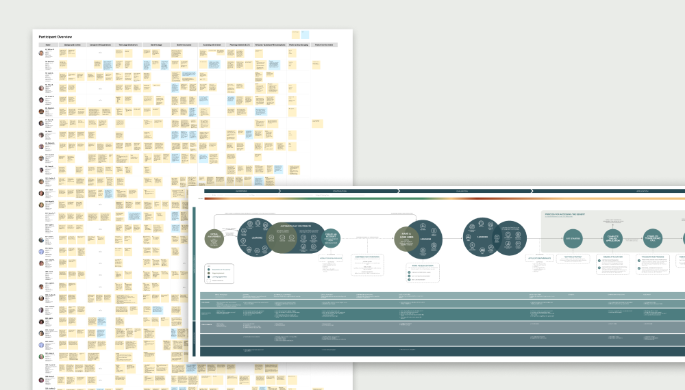
We created foundational documents to help guide the team across a project we knew would span years, including an experience blueprint, personas, user journeys of many key processes, and a massive end-to-end map of the application process that laid out every path.
Building education into design
Because WA Cares is the first benefit of its kind and a social program, many Washingtonians are still learning about it or learned about it through a politicized lens. Our job was to help everyone get the most benefit from it, which required building education about WA Cares into the product as you used it.
When designing for something brand new, I think it's really important to understand the mental model that users bring with them. What other things are they using as a lens to understand this thing? In this case, many assumed that this worked like a retirement account or Social Security: The money you put in affects what you get out. By using the vocabulary of insurance and getting very crisp in our writing we were able to shape more accurate mental models that really helped people understand their benefit and increased comprehension of the portal's screens without any other design changes.
We paired this broad framing with concrete examples. An interactive calculator helped people understand the mechanics of the fund visually. Example receipts illustrating specific ways to use the fund helped people see how this works alongside health insurance and dispel misunderstandings, like that all long term care means residential care.
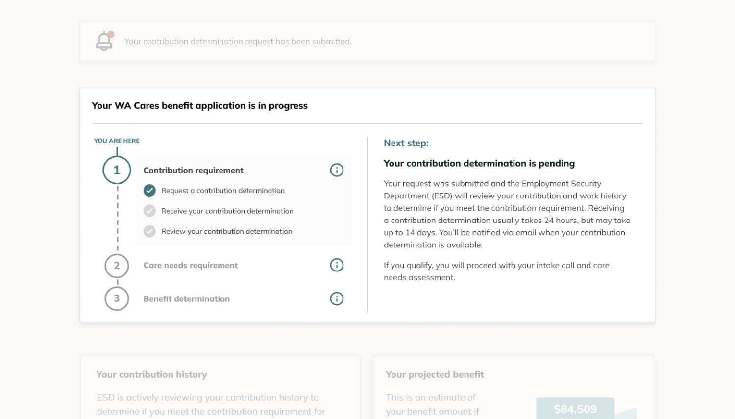
One simple pattern that works well for complex user flows is always let the user see the overall journey, where they are, and what the very next step is. This was especially true for WA Cares because users interact with it over literal decades and it may be years between logins. Many Washingtonians might pay into it their whole career but only use it in old age. We created a modular dashboard and sweated the details of dozens of use cases, so that when users log in they are greeted with something at the top that makes sense for them.